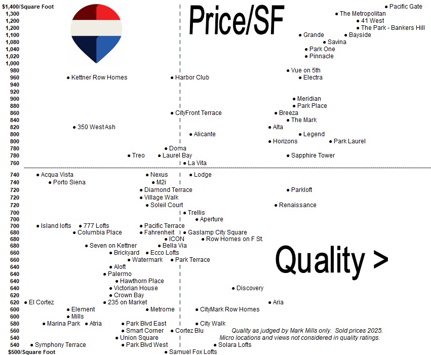
What This Chart Shows (Plain English)
This chart compares downtown San Diego condo buildings on two critical dimensions:
-
Vertical axis (Price per Square Foot):
Higher = buyers are paying more per square foot. -
Horizontal axis (Quality):
Further right = higher overall quality (construction, amenities, reputation, buyer demand).
Each dot represents a specific condo building, based on 2025 sold prices.
The Most Important Insight
Not all expensive condos are high quality—and not all high-quality condos are expensive.
This chart shows how efficiently each building converts quality into value.
How to Read the Chart (Step-by-Step)
1. Upper-Right Quadrant = Best Long-Term Value
Buildings in the upper-right have:
-
High price per square foot
-
High perceived quality
-
Strong buyer demand
-
Best resale history
Example:
Pacific Gate, The Metropolitan, Savina, Bayside
👉 These are the buildings that tend to hold value best and recover first after market slowdowns.
2. Upper-Left Quadrant = Overpriced for Quality
Buildings high on price but left on quality are:
-
Expensive relative to what buyers get
-
More vulnerable in softer markets
-
Often harder to resell without price adjustments
👉 Buyers here are paying a premium that may not be fully supported by long-term demand.
3. Lower-Right Quadrant = Opportunity / Value Plays
These buildings offer:
-
Solid quality
-
Lower price per square foot
-
Better value relative to peers
👉 Great for buyers who want quality but are price-sensitive or looking for upside.
4. Lower-Left Quadrant = Budget / Trade-Off Zone
These are:
-
Lower-priced
-
Lower-quality or older buildings
-
More sensitive to market shifts
👉 Fine for entry-level buyers, but historically weaker resale performance.
-----------------------------------------------------------------------------------------------------------------------
Notice how Pacific Gate sits at the extreme top-right—highest quality and highest price per square foot. That’s why it consistently leads downtown in resale performance.


 Freshest Data Available